
HOUSE DUCK · AUTOMATIC TRANSLATION
Designing Game Characters with Prompts | House Duck Vibecoding
When you ask AI to create a game character,
a plausible single image comes out pretty quickly.
The problem was what came next.
When asked to redraw the same person, the face changed,
when the expression changed, even the clothes changed,
and when scaled down onto the game screen, the eyes and mouth merged into a single lump.
Looking at just one image, you might like it,
but when placing multiple images side by side, they often didn't look like the same game.
Producing pretty images and
creating game characters were two different things.
Even if a single prompt gave you an image you liked,
whether that image would continue to survive inside the game was a separate issue.
Project K, Quirky Ball,
and while making a next project
whose game title wasn't even decided yet, I learned.
A single well-drawn image was the most dangerous.
The initial character art of Project K
shows very clear traces of generative imagery when viewed now.
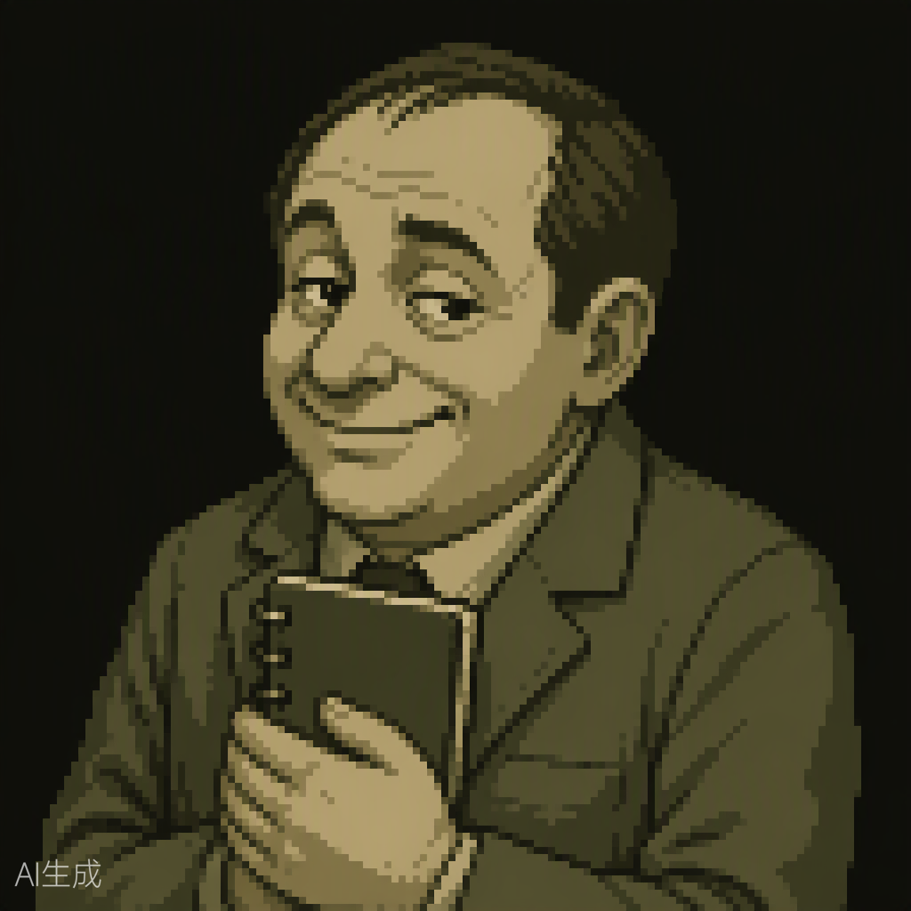
Just looking at a single picture, the character seemed to have presence.
However, wanting to quickly showcase the characteristics of the worldview,
we repeatedly inserted similar appearance conditions,
so the leader candidates all gathered with similar ages and body types.
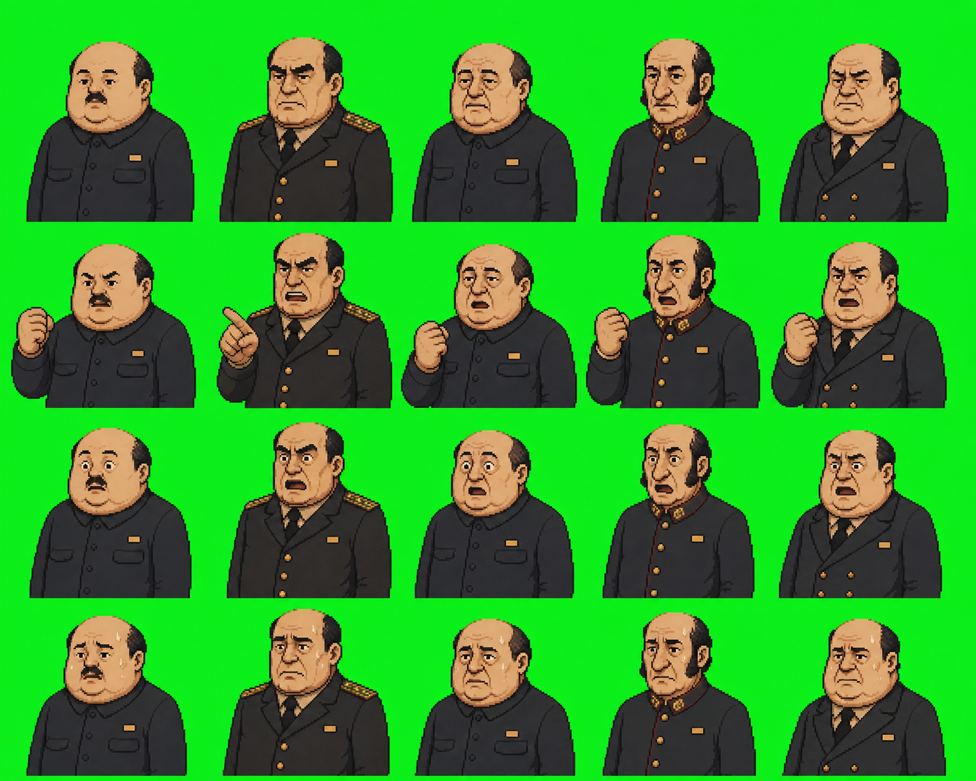
Expressions became more varied,
but if you covered the names, it was hard to tell who was who immediately.
So, instead of increasing the number of characters,
we changed to first diversifying
face shapes, body types, hairstyles, and clothing silhouettes.
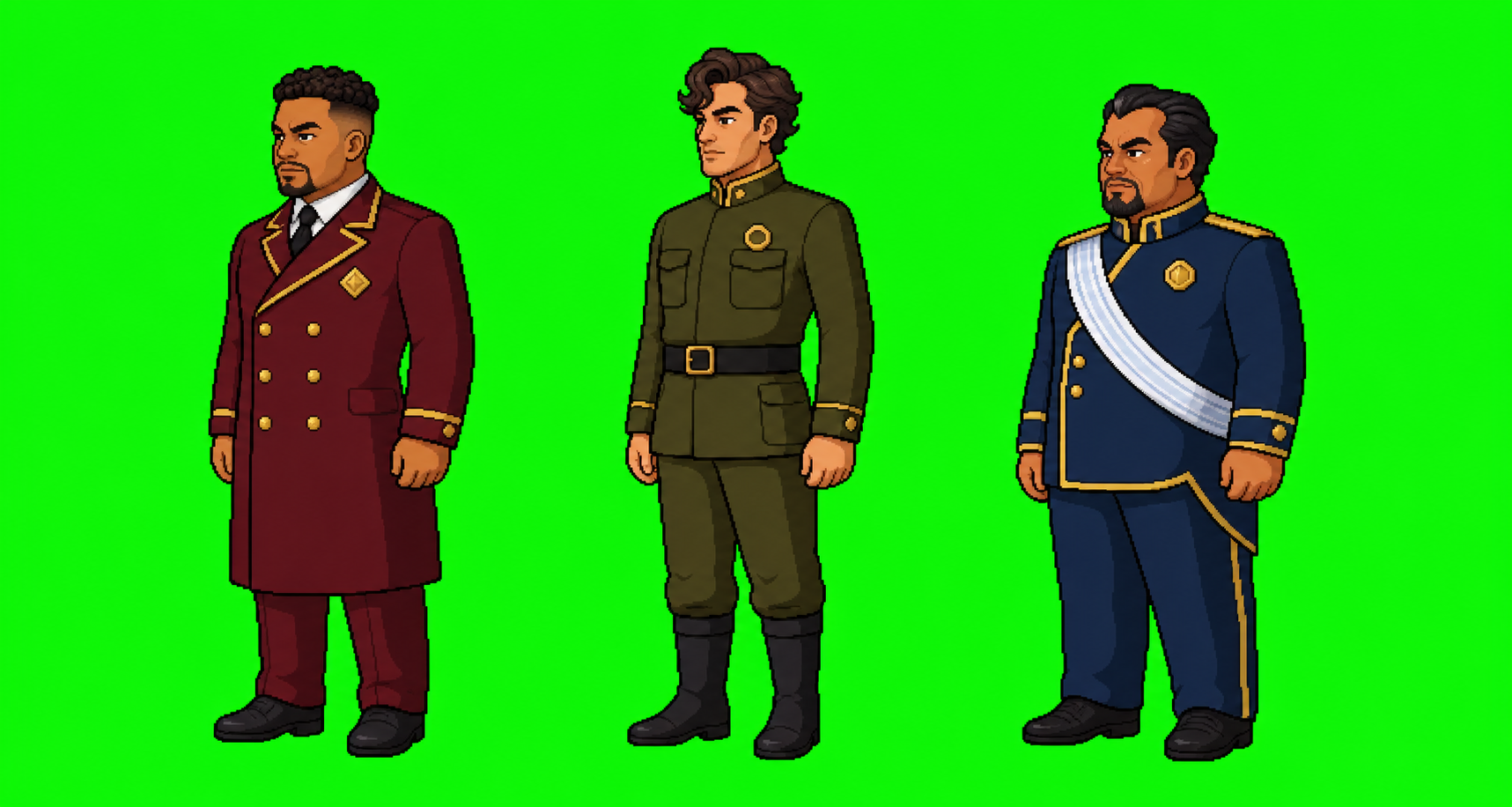
They passed automated checks a lot
and matched image sizes and file specifications.
Yet, when actually placed on the mobile screen,
fine details like hair, clothing wrinkles, and gloss remained,
giving a feeling that they were disconnected from the game's pixel screen.
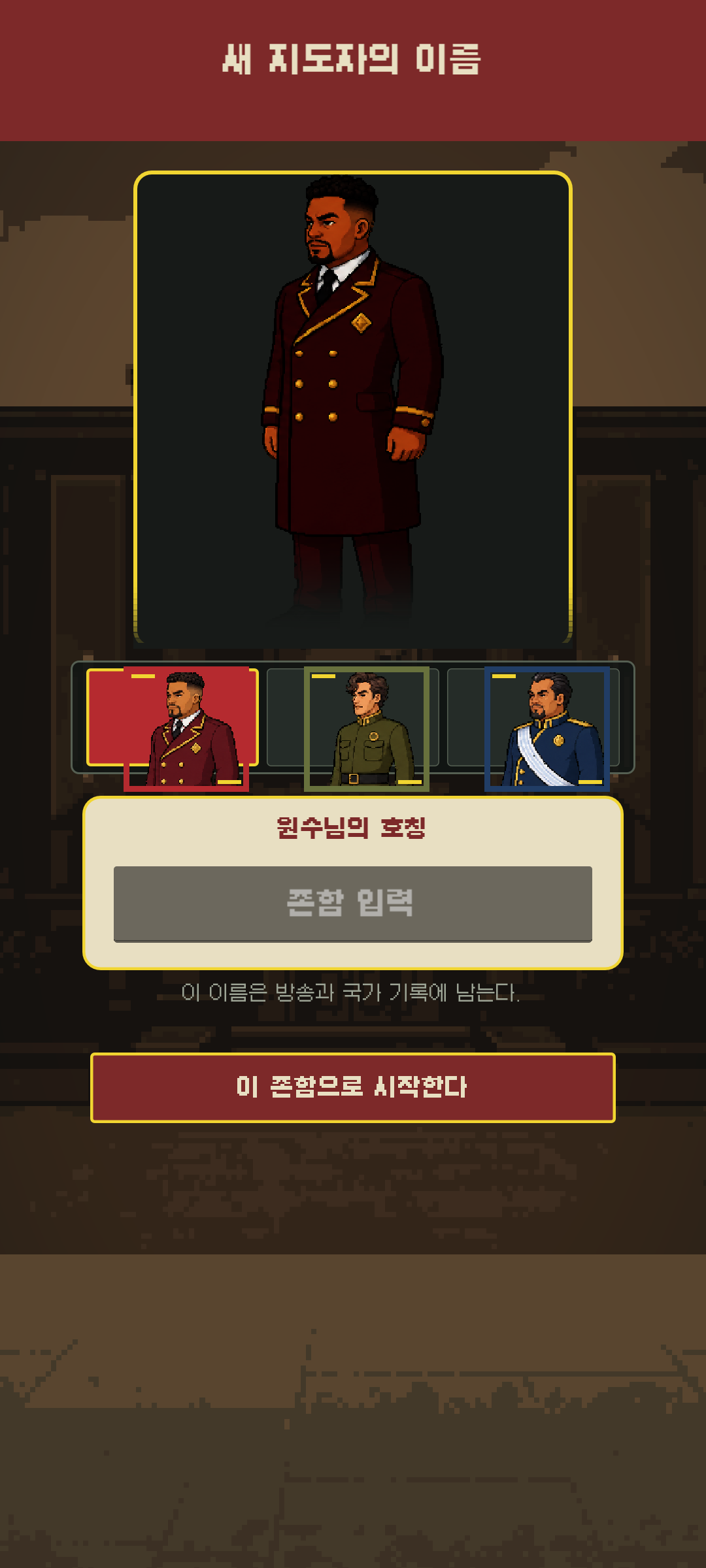
A normal file did not mean the artwork itself was good.
Ultimately, Project K abandoned the direction of applying stronger pixel filters and
re-adopted making a single 3D original properly first,
then pulling portraits, profiles, and card images from that original.
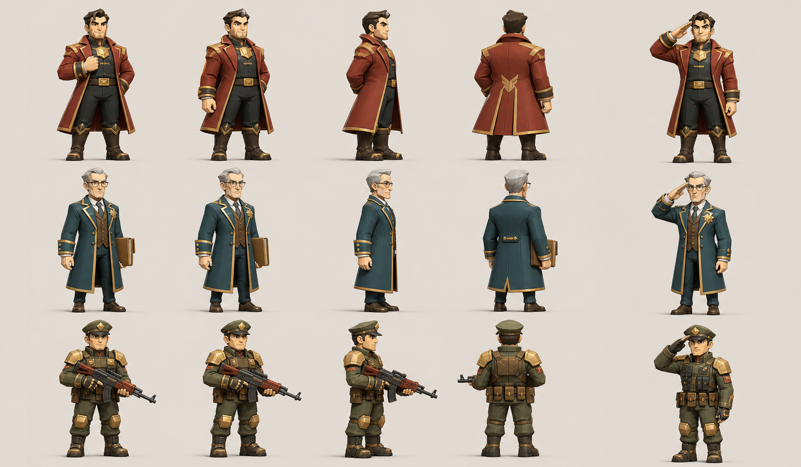
The image above is also not a final game asset.
It is closer to an approved character direction board,
and the actual 3D original to put into the game is still being made.
Finding a direction you like
and not speaking as if it were finished was quite important.
We changed prompts from being reviews to production instructions.
At first, we thought that adding many adjectives like
cool, luxurious, or cinematic would make things better.
Now we write them the opposite way.
We first write down what role this character plays,
what size they appear on the screen,
and what must not change.
Role: A leader immediately readable on the mobile screen
Distinction: Face shape, body type, hair, long coat silhouette
Fixed: Front, side, and back of the same person, same outfit and signature color
Shading: 2 to 3 step cell shading centered on base color and shadows
Prohibited: Resemblance to real people, skin noise, micro-wrinkles, text, and watermarks
Inspection: Eyes, nose, mouth, and role must be readable even when scaled down to actual game size
This is not the exact original prompt used at the time.
It is a reorganization of the production conditions left behind after multiple failures,
formatted into a prompt style.
And we do not make dozens at once.
We pull just a few representative characters first,
put them into the actual UI and game screen, and then move on to the next batch.
Establishing rejection criteria first was faster than increasing generation attempts.
Quirky Ball became a character by drawing less, paradoxically.
Quirky Ball's face wasn't what it is now from the beginning.
At one point, we even tried attaching faces to ordinary beads,
The red hexagonal Quirky was wearing a big-toothed smile.
When everything inside the screen looked like a character,
it became blurry who the main protagonist actually was.
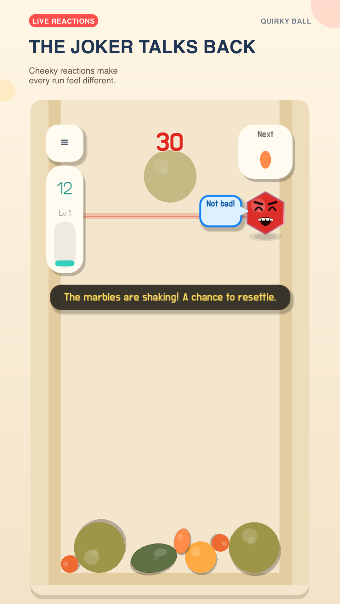
So, we removed the faces from regular orbs
and left only Quirky as a character with sanpaku eyes and thick eyebrows,
and one corner of the mouth raised.
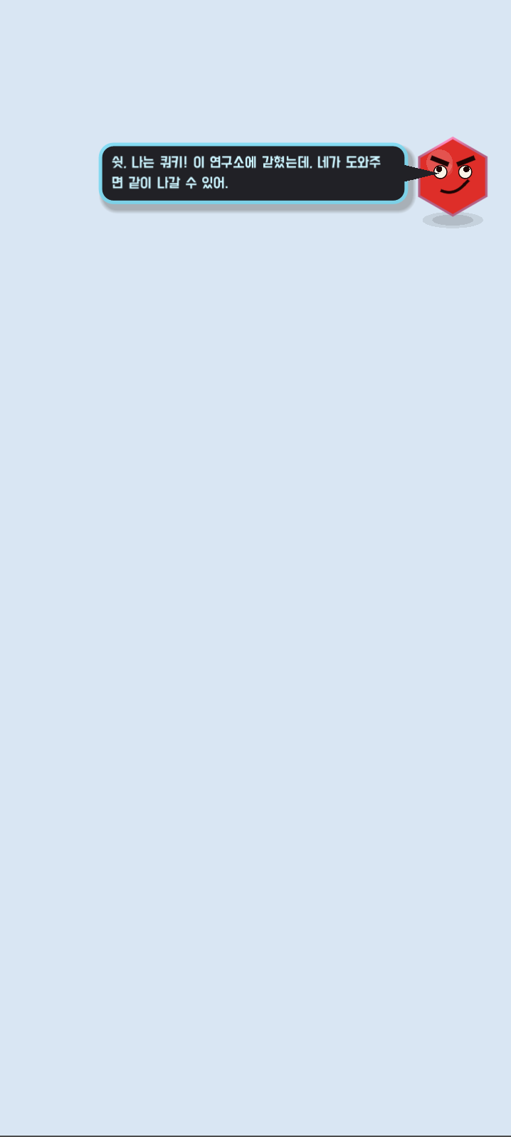
Fixing just the expressions was not the end.
Revealing its name, explaining why it was trapped in the laboratory,
and having it blink, smile, worry, and provoke according to the gameplay situation
was when the red shape finally began to read as a character.
Cutscenes went through a similar process.
Initially, scientists and machines were drawn as simple shapes.
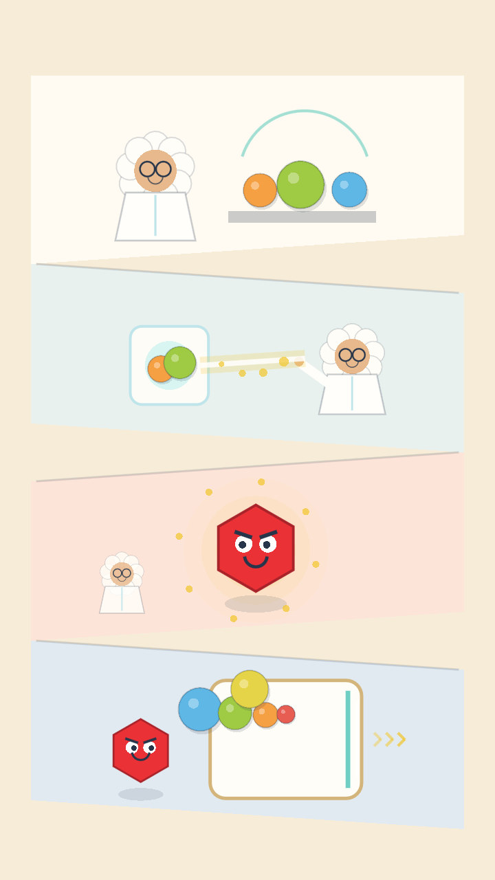
Afterwards, we obtained drafts of the scientist and equipment using generative imagery,
but we did not put those results directly into the game.
We reduced the colors to five, erased the white background,
fixed the size and pixel scale, and rebundled them into a single atlas.
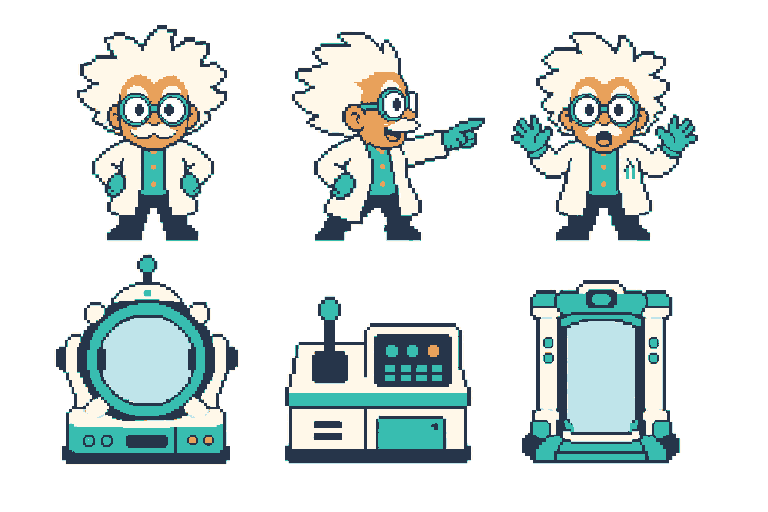
Only after cutting them to the same specifications
did the scientist's face and machine's size not waver even when the scene changed.
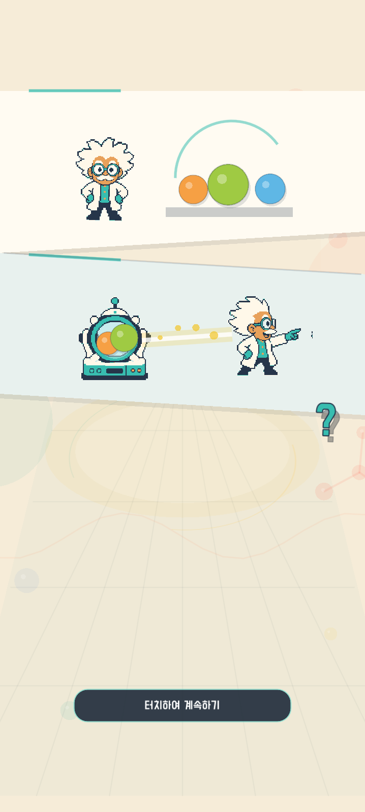
Post-processing rules survived longer than good prompts.
In the upcoming work with an untitled title, we intentionally did not make the final characters.
The early prototype of the upcoming work
was close to a timing game without even characters.
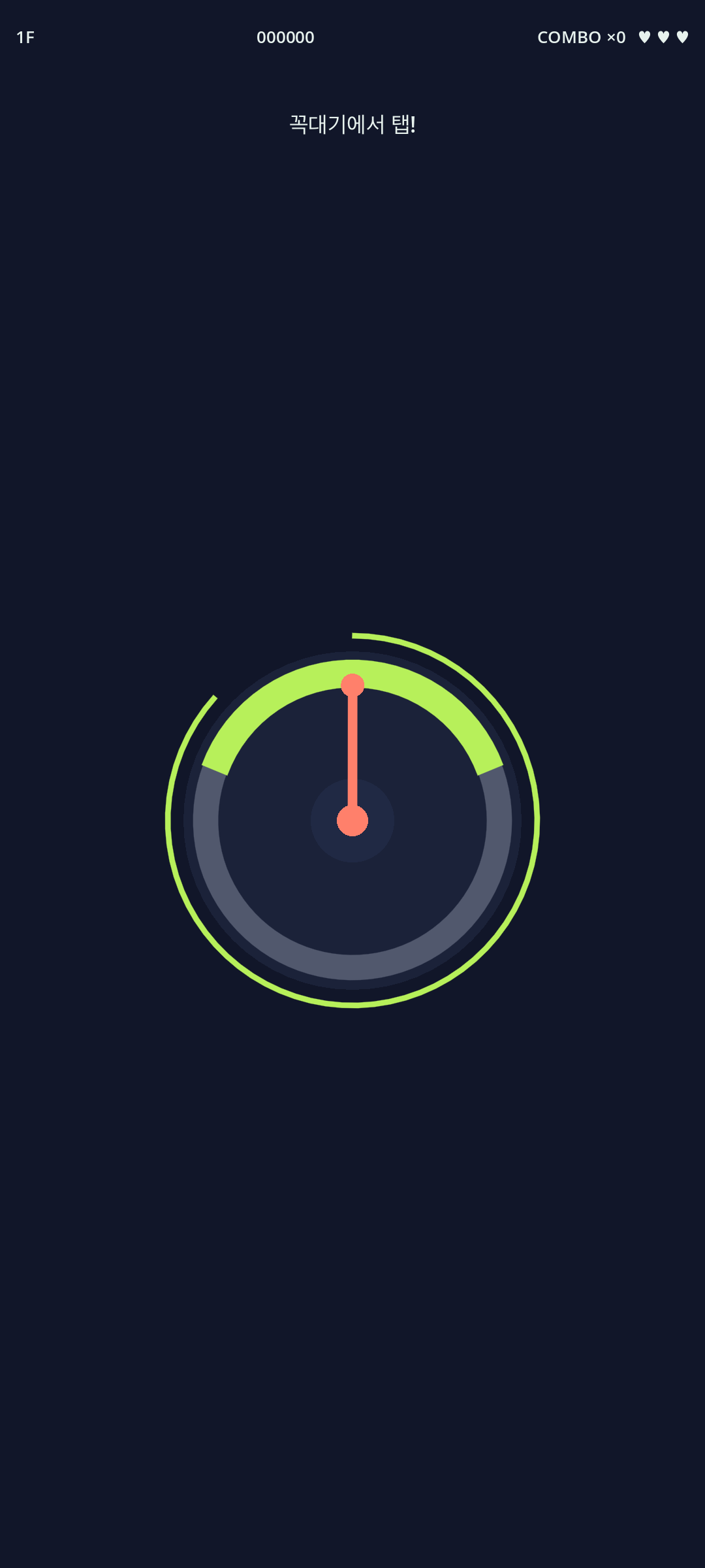
While rebooting, we added a duck, a goose, and a pigeon,
but the birds visible now are low-poly greyboxes made with code.
They are not the final character designs.
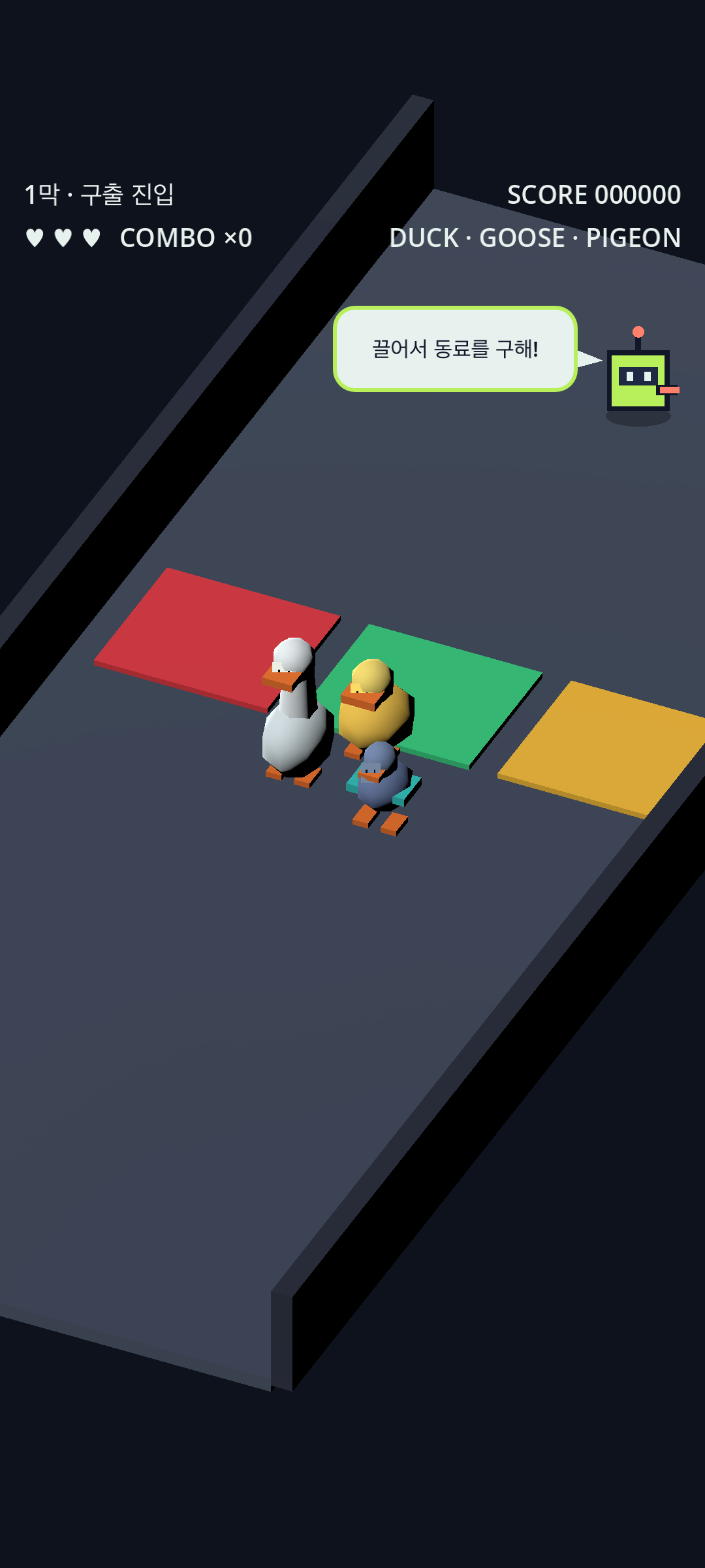
Instead, what we decided first was their roles.
The duck was divided into leadership and balance,
the goose into defense and weight,
and the pigeon into a character that creates paths.
Even if the models are not pretty,
we first check whether dragging, collisions, cover, and rewards are read properly.
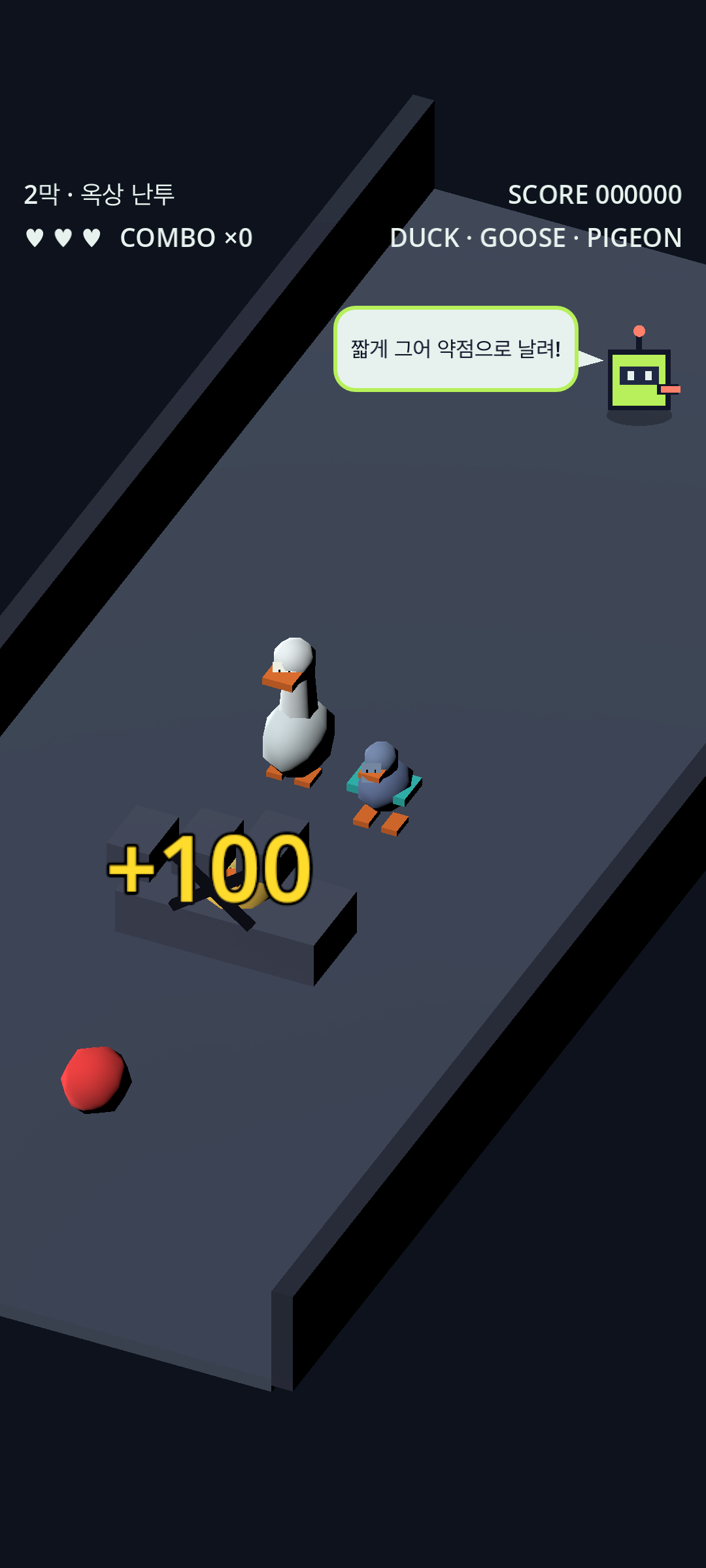
Fun verification by external players has not passed yet either.
So, instead of making a bunch of final cell 3D characters first,
we stopped with a plan to review only the original of one duck species and then expand.
Because adding a dozen more pretty characters to an unfun game
does not make it a fun game.
Just because you like the assets does not mean the game is completed.
When character images turn out well,
it suddenly feels like a lot of the project is finished.
Every time I put a new bird drawing on the screen,
I too was deluded into thinking the game had become quite plausible.
However, whether players will run it again because it is fun, none of that is solved by a single character concept art,
whether the software is completed enough that saves, logins, and payments are not broken, whether the software is completed,
whether the UI is clear enough for a first-time viewer to understand, whether the UI is clear,
whether interactions are agile enough to respond instantly when a button is pressed, whether interactions are agile,
and whether it extends to marketing marketing to announce the existence of the game
is not resolved by a single character concept art.
Rather, the better the assets get,
the higher the standards players expect from the game rise together.
Assets make the starting line look nice.
However, what ultimately makes the game move
is fun and completion.
If a prompt works well and you get a character you like,
you can be glad.
It just means the project went well that day,
not that the game has succeeded.
The next day, you must play again, fix things,
and check the response of a single button and the fun of the first 10 minutes.
There is still too much left to complete the game to be easily swayed by ups and downs.