

HOUSE DUCK · AUTOMATIC TRANSLATION
Designing a game with vibe coding, why I did not make a single asset myself despite majoring in industrial design | Quirky Ball
To start with the conclusion,
although I majored in industrial design,
I did not directly create the game assets for Quirky Ball.
drawing illustrations one by one,
exporting buttons in Photoshop,
or directly refining icons
this is not how I made them.
Even so, the atmosphere of the game is gradually converging into one.
At first, this felt a bit strange to me too.
Graduating from design school, yet not drawing my own game graphics.
However, to finish making the game to the end,
this approach was actually the right one.
Graduating from design school does not mean you have to draw every single graphic yourself.
When you study industrial design,
you often appear to be someone who is good at drawing.
However, the design I learned
rather than creating pretty pictures
was closer to organizing problems.
Who is looking at this screen,
what they need to know first,
and what kind of action to naturally induce
is what you decide.
At Quirky Ball as well, the work assigned to me was the same.
Instead of drawing the marbles myself,
I determined what shape would make them distinguishable at a glance.
Instead of pixel-crafting the scientist myself,
I judged how well this character conveyed
the quirky laboratory atmosphere of the game.
Not drawing pictures did not mean not doing design.
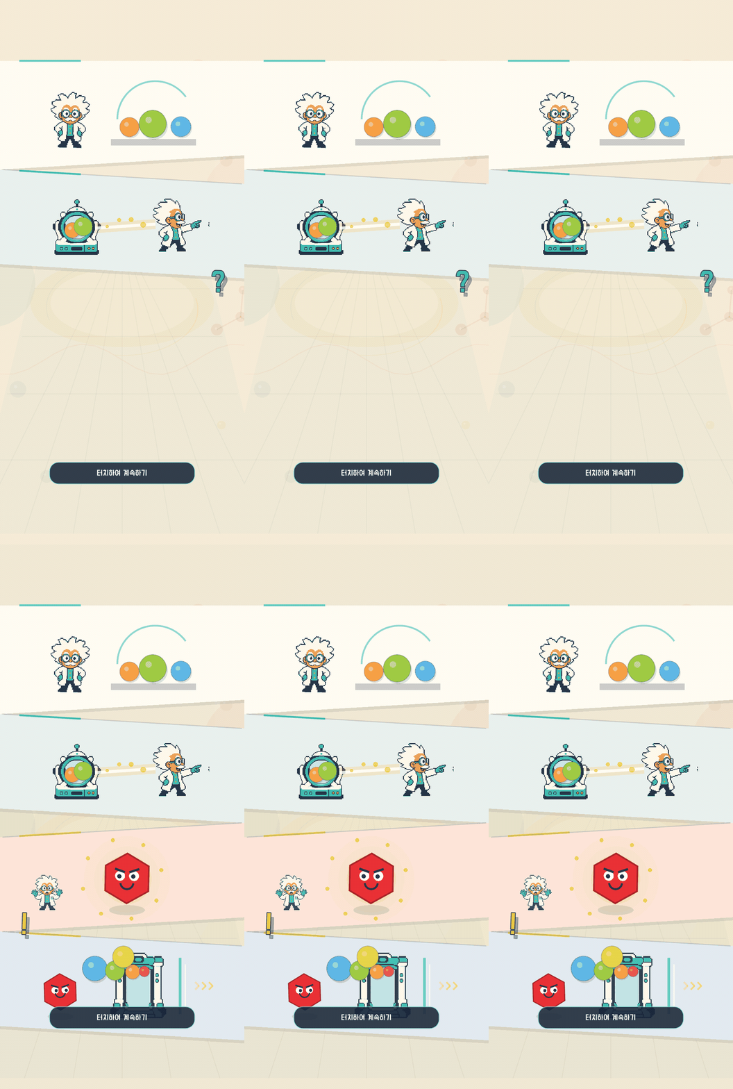
If you start by making assets first, the game is never finished.
The scariest thing in 1 development is not failing to make things.
Things to make keep piling up
while the game remains in a state where it still does not run.
Even if you make just one home screen
you need a background, logo, buttons, icons,
badges, popups, and characters.
If I had tried to finish all of this by hand
and then start development,
I would still be picking colors
on the very first screen.
So I changed the order.
First, I made a playable screen,
and fixed awkward parts inside the actual game.
I quickly pulled out necessary visual elements using AI and code,
and bound only the surviving ones into design rules.
Since I did not wait for completed assets,
I could compare screens much faster.
Most of Quirky Ball is drawn with rules rather than images.
If you tear down the project, unexpectedly
there are far more screens drawn with code than image files.
Marble faces and highlights,
card borders and shadows,
button presses, and small badges and icons
are combined within the game.
The advantage of this method
is that fixing one thing improves multiple screens together.
The size of rounded corners,
the direction of shadows,
and accent colors set as rules
eliminate the need to create new images for every shop card.
Like packages, currencies, tickets, and cosmetics,
even if the contents differ,
they end up looking like screens from the same game.
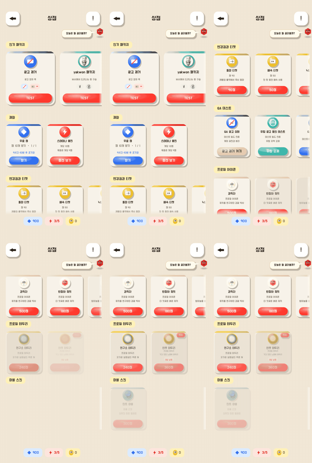
It was not organized this way from the beginning.
Every button had a different color,
icon expressions were mixed,
and information order differed across cards.
Instead of fixing each one prettily,
fixing the common rules first
allowed the entire screen to be organized quickly.
The design I did was about choosing and discarding.
Vibe coding produces results very quickly.
The problem is that not only good results come out fast.
Screens that look plausible but do not fit the game,
icons that stick out alone,
and hard-to-read color combinations pour out as well.
So, the thing I did the most was
not making new things,
but comparing and discarding things.
I captured the execution screens,
checked what was visible first,
and wrote down the problem in a single sentence.
I looked at the modified screen again,
and if it still felt awkward, I discarded it once more.
The ranking screen went through the same process.
Instead of just listing ranking numbers,
the podium, my rank, season information,
and the entrances to various rankings
were organized to be readable on a single screen.
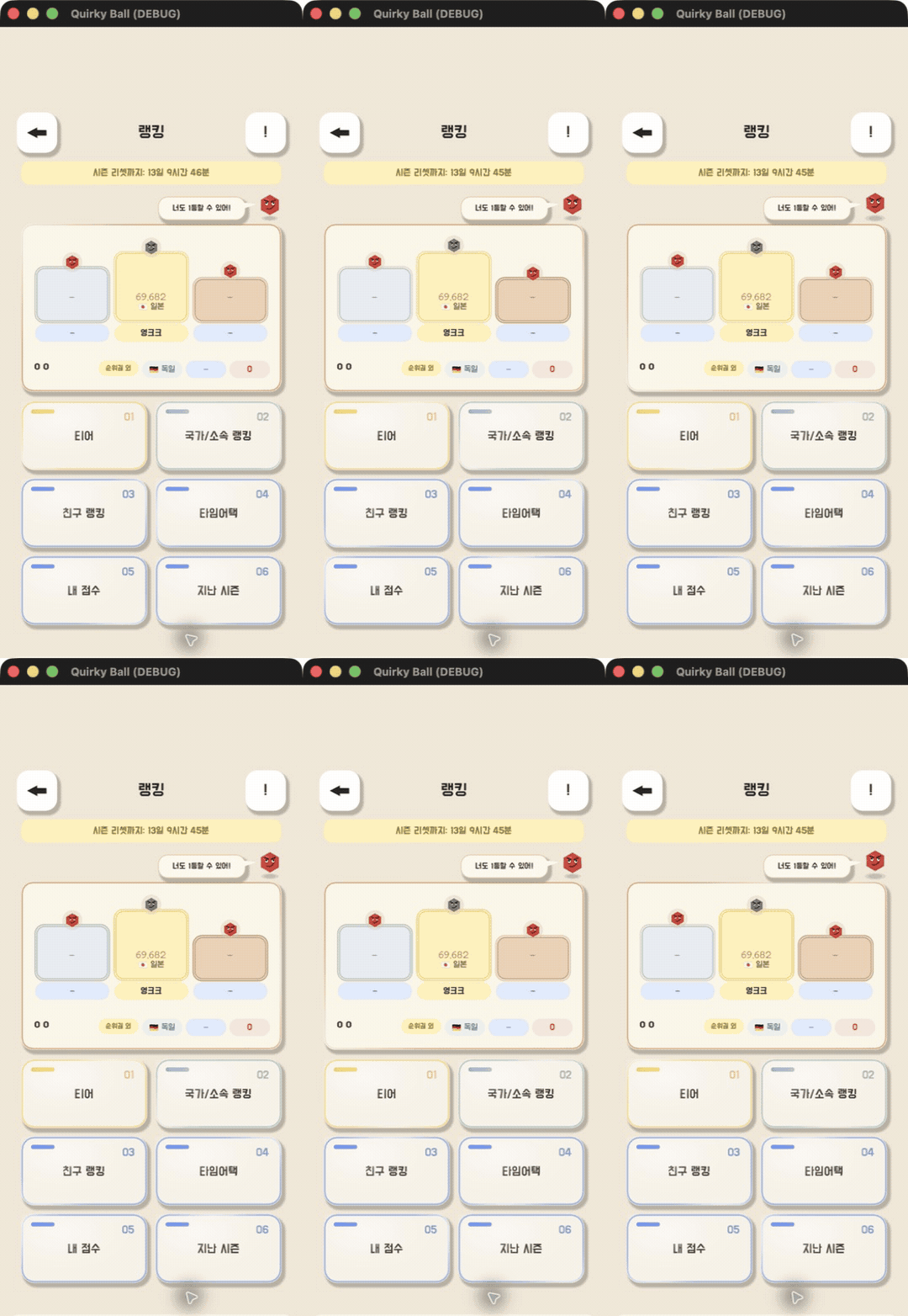
Here, design was not decoration, but the task of ordering information.
A button that prevents accidental clicks came before a pretty button.
Simply making the game screen pretty
does not increase the level of completeness.
How the player's fingers actually move
must also be designed.
In Quirky Ball, when your level increases,
a screen appears where you choose one of
two growth directions.
However, if the finger that was rapidly tapping the screen
in the previous action remains right there,
the moment the pop-up appears,
you might end up clicking an unintended choice.
Therefore, the selection button is displayed in a dimmed state for the first 1.5 seconds
and does not accept input either.
As time passes, the color and contrast return
and the button becomes active.
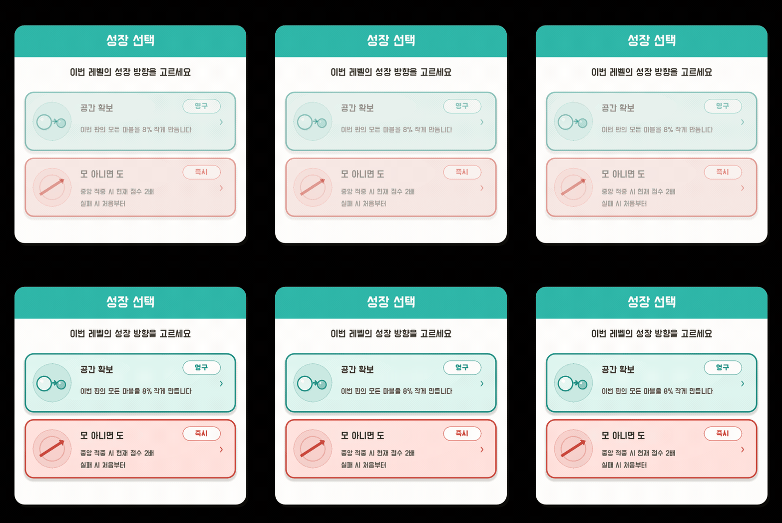
The dimmed state and the vivid state must be clearly different
so the player can immediately understand
whether it can be pressed right now.
Things like this are easily missed
when making just a single screenshot look pretty.
However, if you build while continuously running the actual game,
you eventually discover them.
The completeness of game design as I think of it
comes from such small safety devices.
Just because AI made it does not mean the design is automatically completed.
AI can make screens quickly.
However, it does not know what kind of screen is truly like Quirky Ball.
Which button should be shown larger,
which joke should remain and which decoration should be discarded,
and whether text is actually legible on a mobile screen
must ultimately be decided by a human.
What I did
was not telling AI to make something cool once
and finishing there.
I repeated running the game,
capturing it,
stating the problem specifically,
and comparing again.
Ultimately, in vibe coding,
the moment when a design sense is needed
was the moment of choosing, rather than the moment of making.
If I were to make it again, would I do it the same way?
I probably would do it the same way.
Instead of creating a perfect asset bundle from the start,
I would start by making playable screens.
And when shapes and colors used repeatedly
start to become visible,
I would bundle them into design rules.
Instead of drawing directly,
I will look more,
speak more accurately,
and discard more coldly.
The reason why I, a design major,
did not create a single asset myself
is not because I gave up on drawing.
It is because I chose a design approach
that allows me to finish a game all by myself.